Unless you’re a seasoned graphic designer you might not know that colour psychology is a thing. In reality, every pixel of your exhibition stand design matters not least when it comes to what colours are used to get your message across.
At Human Built, colour psychology is something we’ll consider when designing your exhibition stand and also while furnishing your wider display. That’s because we know how important it is for your brand colours to be represented, plus your commercial objectives to be reached through the use of colour.
To highlight the importance of colour psychology in stand design, we’ve put together the following guide. But for tailored advice on the shades and tones that might work for your exhibition creatives, our team can also speak with you personally.
What Is Colour Psychology?
Colour psychology uses colour as a form of visual communication, based on the emotions, behaviours and perceptions that different colours can evoke.
We’re talking about colour psychology in terms of exhibition stands, but you might also be familiar with the concept within interior design (i.e. paint colours) or even clothing colours.
That’s because the colours we use have different meanings and therefore can be used to achieve specific aims in many different scenarios.
Understanding The Meaning Of Colours
Colours can influence how we think, feel and respond to something. That’s why when designing any creative assets, it’s important to consider the use of colour. Beyond the colours of your branding identity, other creative assets for your exhibition stand may feature additional colours.
These are some of the most common colour associations to know:
Black – Protection, power, elegance, mystical, formal, strength, depression, sadness and dominance.
Blue – Security, trust, loyalty, responsible, calm, peace, honesty, conservative, passive, sadness and predictable.
Green – Harmony, safety, growth, health, revitalise, encouragement, generosity, hope, prosperity, luck, envy and inexperience.
Grey – Compromise, neutral, control, practical, stabilise, soothing, reliable, maturity, intellect, pessimistic, sad, indecisive and unemotional.
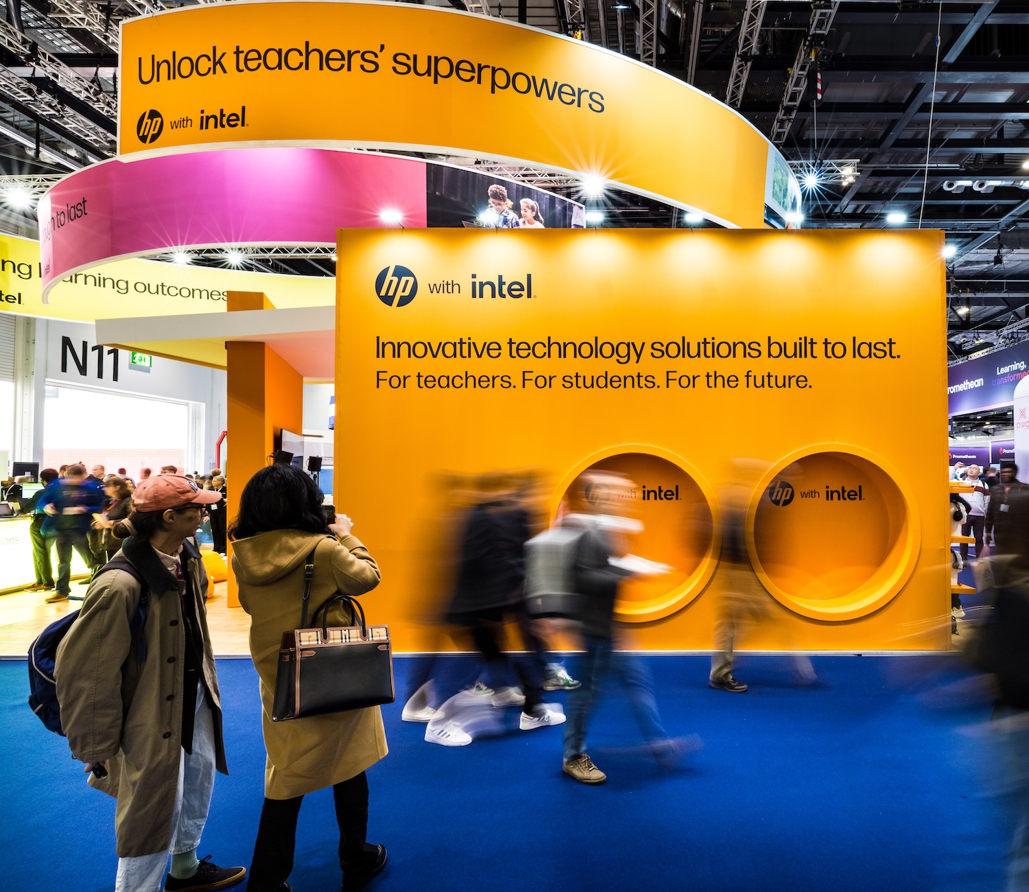
Orange – Emotion, youth, optimism, enthusiasm, uplifting, stimulation, communication, creativity, warm, positivity, superficial and impatient.
Pink – Compassion, love, femininity, playfulness, sympathetic, nurturing, kindness, romance, intuition, emotional and timid.
Purple – Spirituality, mystery, royalty, imagination, enlightenment, inspiration, uplifting, fantasy, wisdom, creativity, sensitivity, vigilance and immaturity.
Red – Action, strength, energy, passion, attention, motivation, stimulation, courage, desire, confidence, anger, danger, revenge and aggression.
White – Pure, innocent, clean, fresh, peaceful and innocent.
Yellow – Happiness, optimism, positivity, intellect, clarification, inspiration, amusement, energetic, creative, perception, mentality, warmth, cowardice, perception, egotism and caution.
Good to note: Every colour can have several meanings attached, meaning colour psychology also considers how a colour is used within the design.
As different shades of colours also exist (Hex codes) the precise shade can be selected based on the association of the colour we want to highlight.
Why Does Colour Psychology Matter For My Exhibition Stand?
Now we’ve covered some common colour associations, you can begin to see why it matters to consider which colours you choose for your exhibition display stand. Plus the colours of any additional creative assets such as brochures, POS displays or wayfinding signage.
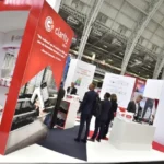
The simple fact is that exhibitions aren’t cheap to attend. At the same time, events also offer huge potential for businesses to get more customers. First impressions count, and one of the most memorable aspects of a display stand is colour.
Colour psychology can be used to achieve all your commercial objectives as a business so that your overall event attendance ROI can be maximised.
Here are just some of the ways a consideration of colour psychology can be used to your advantage as an exhibitor.
Build Brand Recognition
As a business, you likely have a set of branding guidelines that feature specific colours (CMYK & RGB or hex codes) which represent your brand. Within your exhibition stand design, it’s a given that these colours need to feature within your creative assets. This is to ensure that your brand is recognisable among your industry peers and customer base.
If your brand guidelines have been designed professionally, then your branding colours will have been chosen based on what it is you do as a company. Over time, your brand colours should build recognition wherever your branding appears including at events so that people can instantly notice you in the crowd.
Over the years, colour has been used to successfully build brand recognition for lots of companies. For instance, Easyjet’s use of orange or Cadbury’s use of purple. These colours are used as part of a wider marketing strategy by companies so that the colour psychology has more depth of meaning, and ultimately is more impactful. Your brand can absolutely replicate this same winning formula.
Clear Messaging & CTAs
Colour can drive home a message without even having to use words. Just like when you see a red stop sign you know it means it could be dangerous to continue. In contrast, green is a colour we associate with ‘go’ or safety.
Within advertising, colour is also hugely impactful in driving home messages whether these are instructions or CTAs (call-to-action).
It’s a good idea to think about the conversional actions you’d like to generate at your event. This could be encouraging visits to your stand, networking, product interactions, website visits, social media follows or similar actions which form part of your wider sales funnel.
In response, colour can be used throughout your display stand to draw attention to these messages and also communicate them in a way that is more likely to achieve them. This is made possible by considering colour psychology including common associations of certain colours. All of which ensures we select the most appropriate colours based on the aim of the creative asset.
Communicate Brand Principles
Beyond any colours which belong specifically to your brand, your exhibition stand and any marketing materials may also feature additional colours. These colours can be selected based on your industry and the types of associations you want to convey about your brand as a whole.
Persuade & Influence Decisions
In colour psychology, colours are used based on what they communicate to the audience.
Think about some brands which use red in their logo such as Virgin or Coca Cola. This bold, fiery colour displays a high level of energy and confidence tying in perfectly with the brand positioning.
Or banks such as Barclays or Halifix which use blue within their logo to signify trust.
Another common example of colour psychology in action is McDonald’s, which uses red and yellow as ‘fast’ colours denoting that the food can be ordered and received quickly. Red and yellow also offer a subliminal message to signify fries and ketchup to make us hungry.
Now think about these principles in terms of exhibition stand design. It’s all about deciding what messages we want to convey and most importantly, what actions we want people to take based on how colours are used to communicate.
Summary
As exhibition stand designers, we factor colour psychology into your stand design as part of your event strategy.
Thinking about your brand, industry and overall commercial objectives for the event, it’s essential the use of colour reflects the meanings and associations we want to portray. When done well, colour should ensure your stand is not only eye-catching, but also appeals to the right people with the right messaging.
Beyond the general colour, there are many specific shades of colours as well as deciding which colours have dominance within the design to think about. That’s why exhibition stand design can always benefit from the careful eye of a professional graphic designer who has an acute understanding of visual communication including colour theory and psychology.
Human Built – Exhibition Stand Design & Installation UK
Are you looking to make your next exhibition, trade show or event attendance a success?
Human Built is a creative events agency based in Birmingham working with businesses at event spaces across the UK. Our team can cover all your exhibition stand needs including creative design, stand printing, stand installation, logistics, furniture hire, project management and more.
As part of our vast range of services, we also specialise in colour psychology when designing exhibition stands along with other creative assets that your event may require.
To chat further about your event needs please send us a message.
You can also see our creative event production work in action over on Instagram, Facebook and LinkedIn.